There is something about landscape photography that transforms an environment without asking for permission. It doesn’t make a sound, it doesn’t demand an explanation; it simply opens a window. A new, distinct, and unexpected window. And in that window, a mountain skyline may appear at dawn, the silence of an infinite steppe, or a lake softly touched by the rosy light of daybreak.
When I take photos in Patagonia, I imagine the possibility that someone, in a home far from where I am at this very moment, could stop in front of this same image and feel the same cold air on their face, the same stillness, and the same emotion that I feel right now behind the lens.
That is why choosing which landscape to bring into a home is much more than a decorative detail. It is choosing which feeling you want to welcome you every single day.
Choosing by the style of the space:
Every home has its own identity and visual rhythm. Some houses breathe through wood textures, others through clean lines, and others through vibrant colors. Choosing a photograph should complement that language, staying true to the home’s style without competing with it.
– For a warm and rustic living room
Pieces from the Soulful Landscapes or Ranch Life collections usually work perfectly. Earth tones, soft light, and wide horizons that bring a sense of serenity.
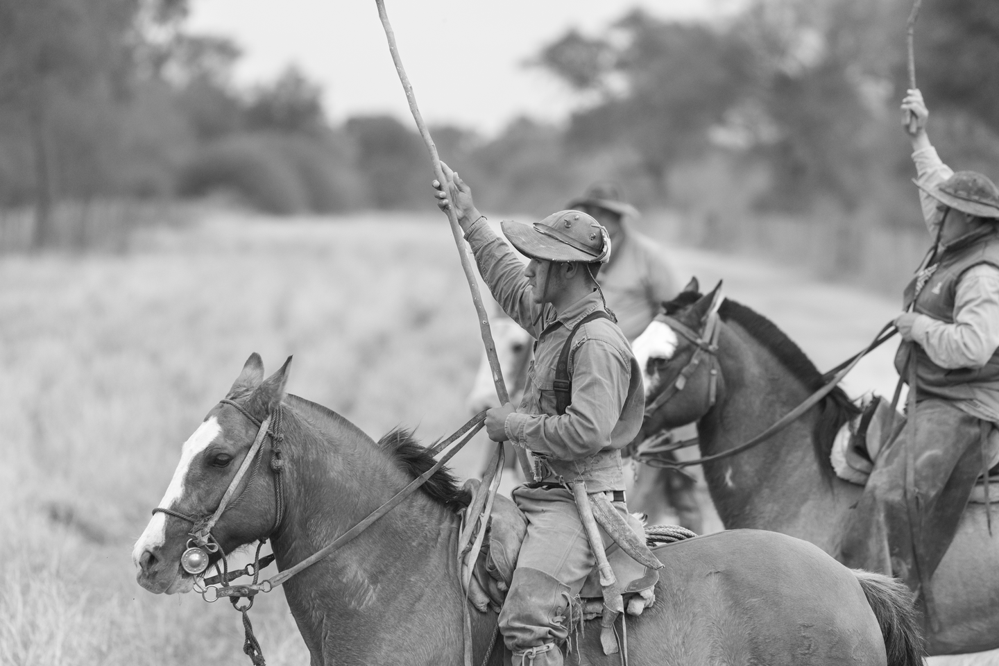
These are images that blend in effortlessly, creating a sense of a “lived-in home.”
– For minimalist or modern spaces
The pieces from Pristine Patagonia—especially those playing with mist, snow, or very sober palettes—dialogue beautifully with empty spaces and pure lines.
Adding a landscape like this is almost like adding silence.
– For offices or focus-driven spaces
Vertical photos of stylized mountains or calm lakes provide a sense of concentration.
The key is for them to convey stability, not chaos.
Color or Black and White: Which one is right for you?
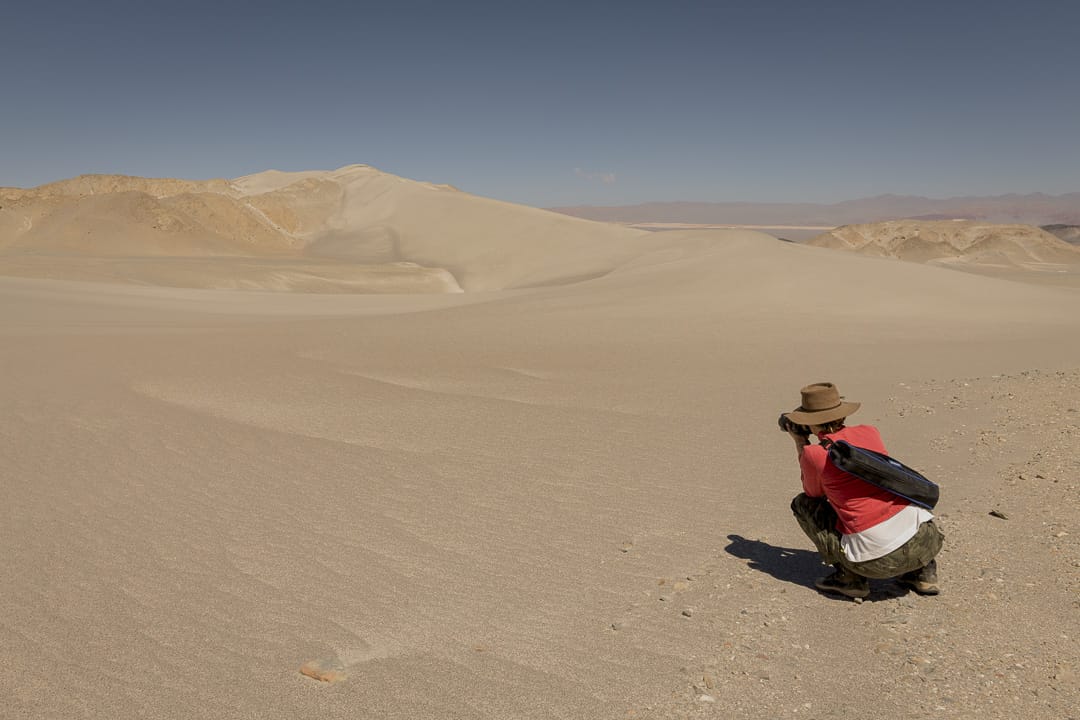
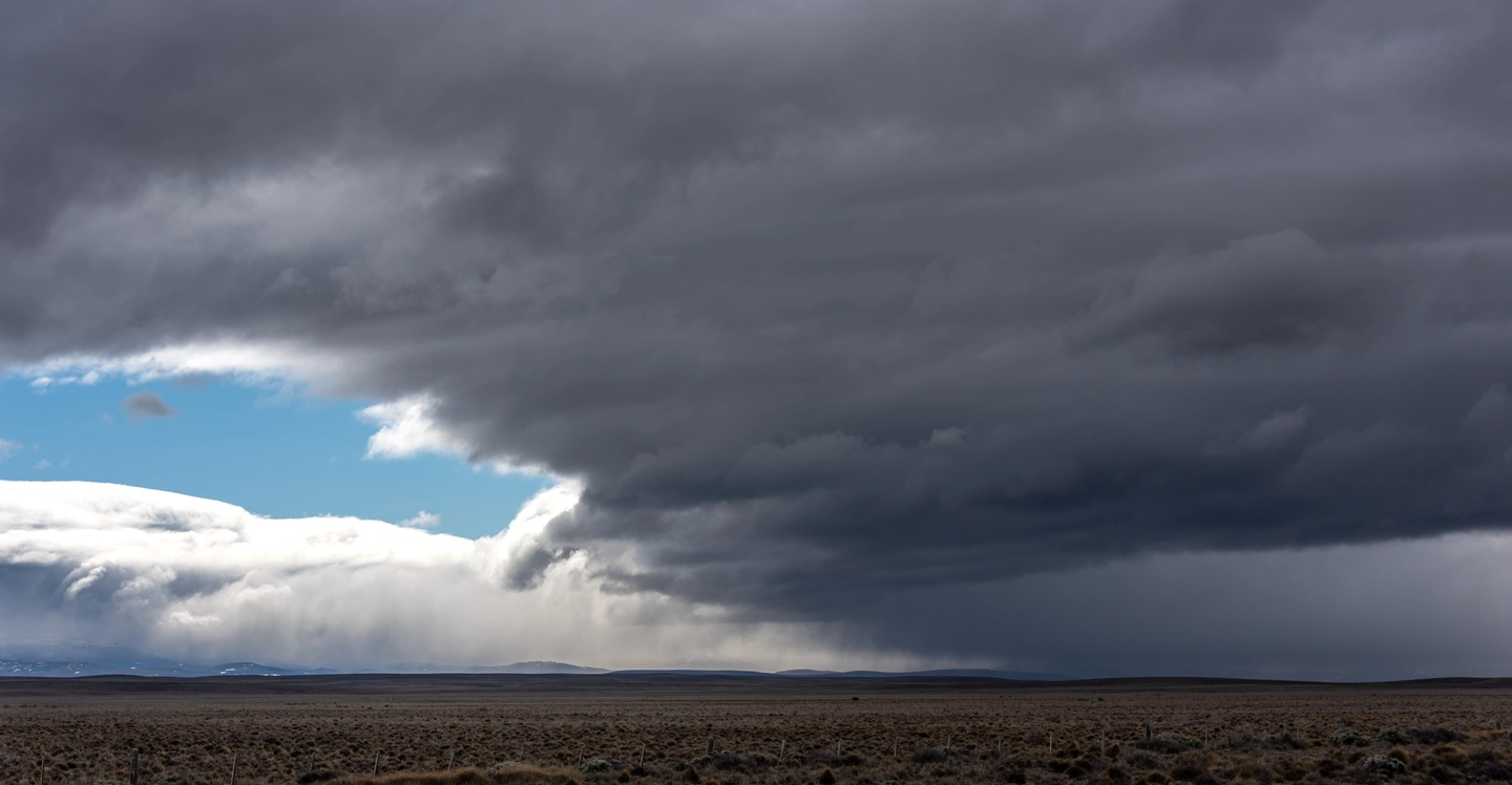
Landscape photography in color holds immense emotional power: it conveys temperature, season, and atmosphere. In my work, pastel palettes abound, offering a profound sense of calm. Patagonia is especially rich in non-saturated palettes: milky blues, muted greens, and sandy tones that make you fall in love with every detail.
However, black and white has a different kind of magic: it organizes the essentials. It allows form to speak louder than color. Pieces from the Black & White collection can completely transform a hallway, a staircase, or an office: they make the space feel more elegant, cleaner, and timeless.
A simple rule:
- If the room already has many colors → Black and White.
- If the room is neutral or warm → Color.
Ideal size according to your wall
A piece that is too small gets lost; one that is too large becomes overwhelming.
The correct proportion is usually:
- Between 60% and 75% of the width of the furniture it accompanies.
- At eye level (center at approx. 1.60 m from the floor).
- For large walls, it is best to consider XL formats or triptychs.
Patagonia is best enjoyed in generous sizes: vastness needs room to breathe.
Real examples with my works on the web
A bedroom with a sand-toned palette paired with a piece from Pristine Patagonia—featuring mountain mist—creates immediate tranquility.
A spacious living room combined with the golden steppe of Soulful Landscapes achieves that warm, “at-home” feeling.
In a minimalist hall, a black and white seascape from the Black and White collection creates a striking, modern impact.
Choosing a landscape is choosing a state of mind. In my case, it’s also about sharing life in Argentina, in Patagonia, and in the countryside exactly as I experience it: authentic, simple, unhurried, and with the marvelous beauty of simplicity.
If you are looking for a piece for your home, you can explore:
And if you need a recommendation based on your space, feel free to reach out: I love being part of that process.
Guille